Candlestick vs Bar Chart, Which One is Better?
- nanovest
- Aug 10, 2022
- 3 min read
Updated: Aug 15, 2022

Candlestick chart and bar chart are two examples of charts which are usually used by investors using a technical analysis approach. These both charts have advantages that are favored by every investor. So, which chart is suitable for you as a beginner investor? Find out how to read candlestick and bar charts as well as the differences between those two in this article!
How to read candlestick chart
The inventor of candlestick charts, Munehisa Homma, believed that investor psychology is as important as demand and supply for stocks. Therefore, candlestick is shown in colors as the representation of the investor psychology for a trading period.
This chart shows 4 price levels at:
open
high
low
close
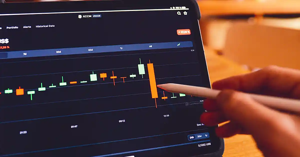
Candlestick charts also have a real body or a wide part. This part represents the price range between the open and close of that day’s trading. So, if the body is red or black, it means the close price is lower than the open price. On the other hand, if the body is green or white, it means the close price is higher than the open price.
Other than the body, the candlestick chart has a part called shadows or tails which are on the upper and lower part of the body. This tail represents the price range at the open and close of that day’s trading. If the tail on the red candlestick is short, it means the trading value for that day is low. On the other hand, if the tail on the green candlestick is short, it means the trading value for that day is high.
According to Investopedia, the candlestick charts are more visual due to the color coding as the representation of market psychology and they also have thicker bodies. Thus, the difference between the open and close price will be clearly displayed. Just like how we read stock chart patterns, there is a certain way to read crypto candlestick charts.
How to read bar chart
Bar chart is a simple version of candlestick chart. This is because bar charts have the same components as candlestick charts: the open, high, low, and close (OHLC) prices. However, bar chart does not have thick bodies, but only vertical and horizontal lines.
Each chart shows the highest and the lowest price of a trading period. The open price is marked by a horizontal line on the left of the vertical line, and the close price is marked by a horizontal line on the right of the vertical line.
If the close price is higher, this chart will be black or green. Whereas, if the close price is lower, the bar chart will be white or red. Furthermore, the gaps between the open and close lines have their own meaning.
If the close is far above the open, the stock trading in that period is quite a lot. This shows that there may be more buying in the future periods. On the other hand, if the close is very near the open, it shows that there is not a lot of stock trading in that period.
Bar chart has more advantages for investors in choosing which trading periods will be analyzed. Therefore, both daily trader and short-term investor can do technical analysis precisely according to whichever period they choose with this chart.
Which one is right for you?
The Blue Collar Investor concluded that the key difference between these two charts is on which price to analyze. Candlestick charts focus more on the price variance between open and close on the current and previous period /day. While bar charts focus more on the price variance between open and close on the same period / day.
So which one is better? The decision is yours to make. Which type of price cap do you want to analyze? Is it the price between two periods or is it within the same period? Still confused? No need to worry! Because Nanovest will provide you with simple charts for each period of your choice to help you as a beginner investor to determine stock prices. It is fun, isn’t it?
Download Nanovest application on Play Store or App Store and register yourself to start investing. Let's Go, what are you waiting for?


Comments